Signal
Rose and amber tones paired with Space Grotesk headings, Inter body text, and JetBrains Mono for code blocks. Sharp shapes with compact spacing and flat cards with bordered code blocks.
Why Use This Preset?
- Bold rose palette with sharp shapes so your documentation communicates energy and precision.
- Compact density so pages pack more content above the fold for data-heavy documentation.
- Monolith navbar so the navigation anchors the page with a strong, unified header.
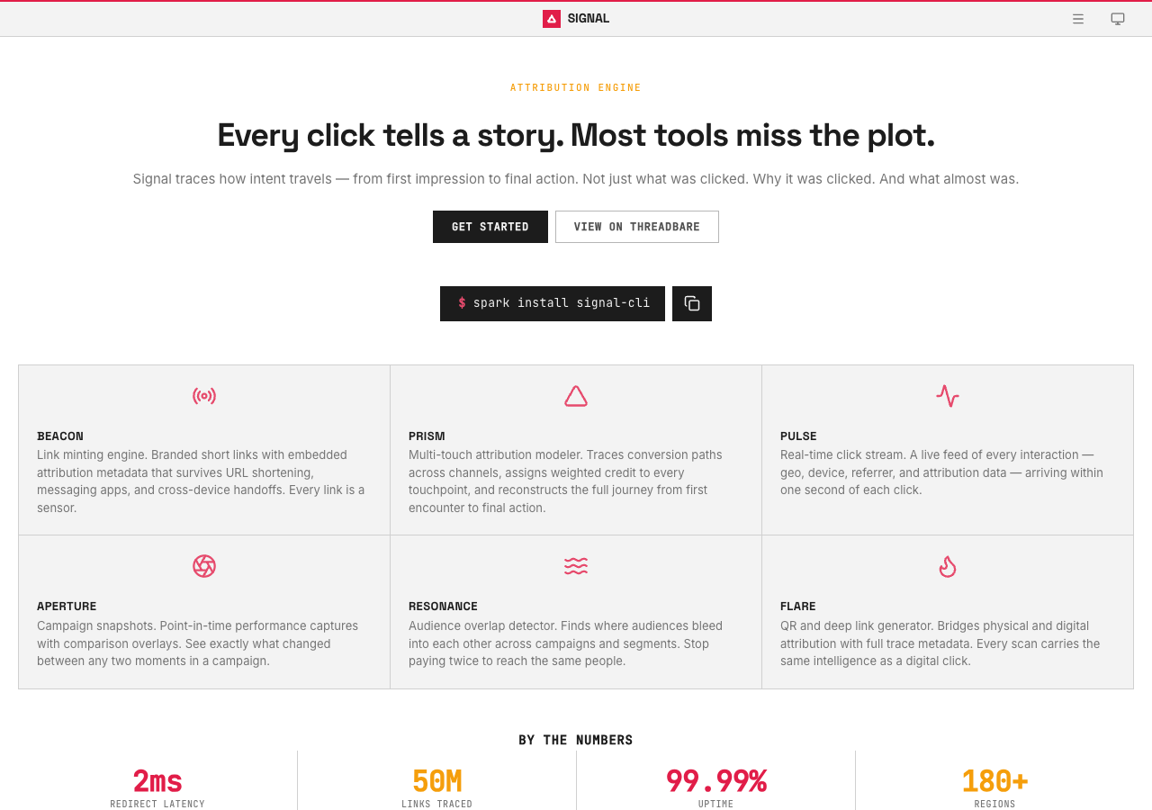
Preview
Summary
Signal is designed for analytics and marketing tool documentation. The bold palette communicates energy while the sharp shapes and compact density maximize information density. Motion is set to subtle speed with staggered reveals disabled and hover effects enabled.
Configuration
The full default configuration for the Signal preset:
{
  preset: 'signal',
  // Default values (no overrides needed):
  // colors.primary:          '#e11d48'
  // colors.accent:           '#f59e0b'
  // colors.neutral:          '#525252'
  // fonts.display:           'Space Grotesk'
  // fonts.body:              'Inter'
  // fonts.code:              'JetBrains Mono'
  // shape.radius:            'sharp'
  // shape.density:           'compact'
  // depth.cards:             'flat'
  // depth.codeBlocks:        'bordered'
  // motion.speed:            'subtle'
  // motion.staggeredReveals: false
  // motion.hoverEffects:     true
  // navbar:                  'monolith'
  // footer:                  'ledger'
}
Overrides
Override any category to customize the Signal identity. Unspecified values keep their defaults.
Navbar and Footer
Signal uses the Monolith navbar and Ledger footer.
| Slot | Variant | Description |
|---|---|---|
| Navbar | monolith | Compact single-bar navigation with inline links. |
| Footer | ledger | Minimal footer with streamlined link layout. |
Override the variant in the preset options:
{
  preset: 'signal',
  overrides: {
    navbar: 'compass',
    footer: 'launchpad',
  },
}
Available navbar variants:
bridgecanopymonolithcompass
Available footer variants:
commonsembassyledgerlaunchpad