Foundry
Warm orange and amber tones paired with Plus Jakarta Sans headings, Inter body text, and Fira Code for code blocks. Rounded shapes with comfortable spacing and elevated cards with soft shadows.
Why Use This Preset?
- Warm orange palette so developer-facing documentation feels approachable rather than sterile.
- Plus Jakarta Sans headings paired with Inter body text so the typography balances personality with readability.
- Elevated cards and staggered reveals so content sections feel layered and polished.
Preview
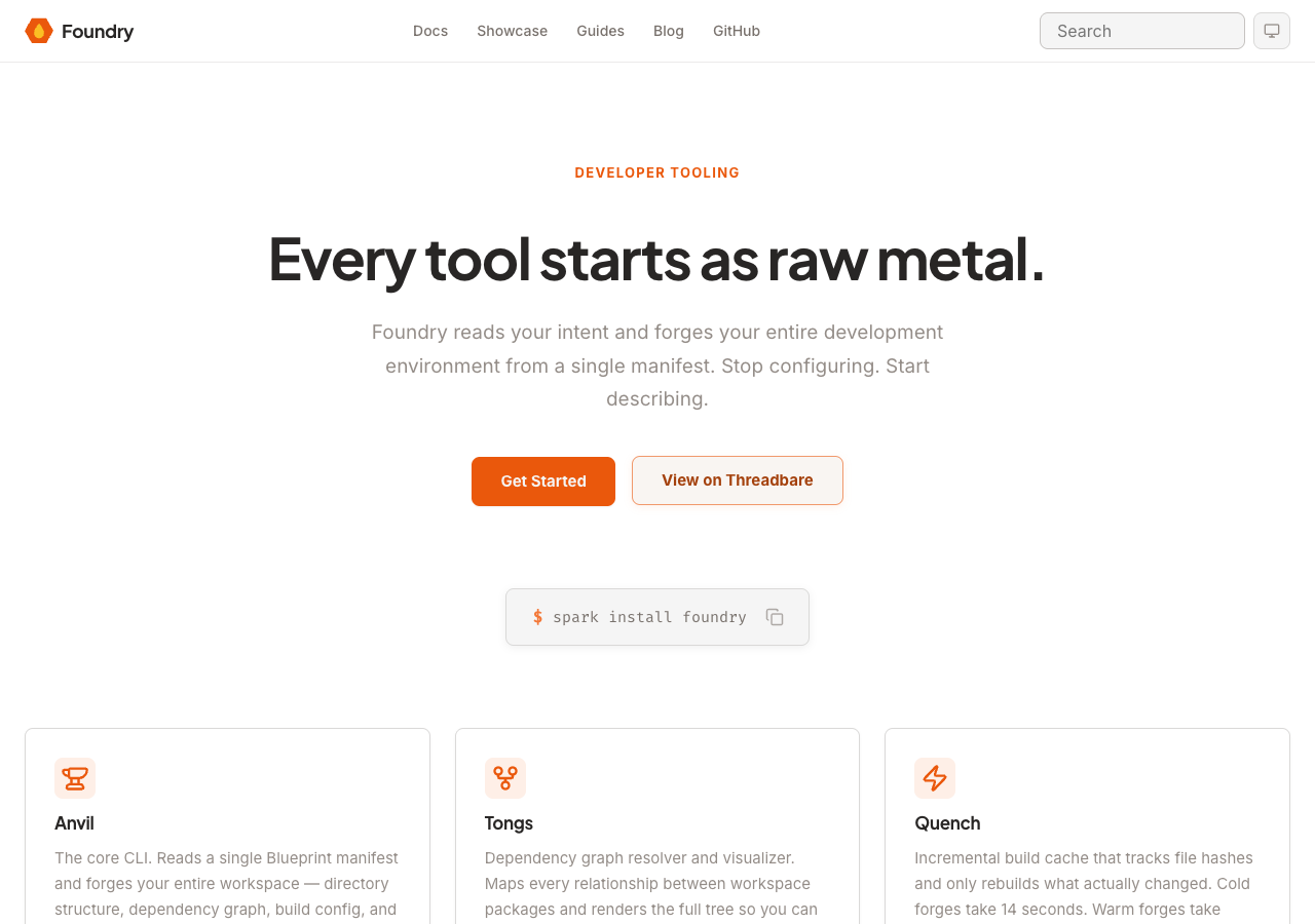
Summary
Foundry is designed for developer tooling and infrastructure documentation. The warm palette communicates approachability while the elevated card depth adds visual hierarchy. Motion is set to normal speed with staggered reveals and hover effects enabled.
Configuration
The full default configuration for the Foundry preset:
{
  preset: 'foundry',
  // Default values (no overrides needed):
  // colors.primary:          '#ea580c'
  // colors.accent:           '#fbbf24'
  // colors.neutral:          '#78716c'
  // fonts.display:           'Plus Jakarta Sans'
  // fonts.body:              'Inter'
  // fonts.code:              'Fira Code'
  // shape.radius:            'rounded'
  // shape.density:           'comfortable'
  // depth.cards:             'elevated'
  // depth.codeBlocks:        'bordered'
  // motion.speed:            'normal'
  // motion.staggeredReveals: true
  // motion.hoverEffects:     true
  // navbar:                  'bridge'
  // footer:                  'commons'
}
Overrides
Override any category to customize the Foundry identity. Unspecified values keep their defaults.
Navbar and Footer
Foundry uses the Bridge navbar and Commons footer.
| Slot | Variant | Description |
|---|---|---|
| Navbar | bridge | Horizontal navigation bar with logo, links, and search. |
| Footer | commons | Multi-column footer with sections, social links, and copyright. |
Override the variant in the preset options:
{
  preset: 'foundry',
  overrides: {
    navbar: 'monolith',
    footer: 'ledger',
  },
}
Available navbar variants:
bridgecanopymonolithcompass
Available footer variants:
commonsembassyledgerlaunchpad