Lantern
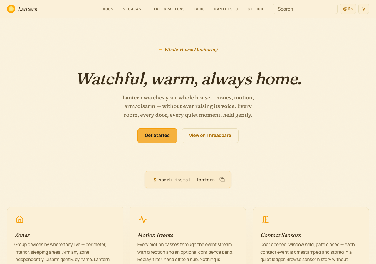
Warm amber and indigo tones paired with Fraunces display headings, Manrope body text, and IBM Plex Mono for code blocks. Rounded shapes with comfortable spacing and warm cream paper cards with asymmetric corners that lift and gain an amber glow on hover.
Why Use This Preset?
- Warm amber palette so home-monitoring and smart-home toolkit documentation feels inviting and domestic rather than clinical.
- Fraunces display headings paired with Manrope body text so the typography balances warmth with structured readability.
- Warm cream paper cards that lift and gain an amber glow on hover, with mobile navigation revealing in a gentle staggered fade, keeping device dashboards and setup guides tactile and polished.
- Compass navbar sets a sticky warm cream bar with the italic Fraunces wordmark on the left, mono uppercase navigation labels beside it, and amber-tinted utility actions on the right.
Preview
Summary
Lantern is designed for whole-house monitoring and home-automation documentation. The warm amber palette communicates familiarity while bordered paper cards and generous section spacing establish visual hierarchy.
Motion is set to normal speed with staggered reveals and hover effects enabled.
Configuration
The full default configuration for the Lantern preset:
{
  preset: 'lantern',
  // Default values (no overrides needed):
  // colors.primary.light:    '#f59e0b'
  // colors.primary.dark:     '#f59e0b'
  // colors.secondary.light:  '#4338ca'
  // colors.secondary.dark:   '#4338ca'
  // colors.text.light:       '#3d2f1a'
  // colors.text.dark:        '#f0e2c0'
  // colors.border.light:     '#e8dcb8'
  // colors.border.dark:      '#4a3d24'
  // colors.warning.light:    '#f59e0b'
  // colors.warning.dark:     '#f59e0b'
  // colors.danger.light:     '#b91c1c'
  // colors.danger.dark:      '#b91c1c'
  // fonts.display:           'Fraunces'
  // fonts.body:              'Manrope'
  // fonts.code:              'IBM Plex Mono'
  // navbar:                  'compass'
  // footer:                  'commons'
}
Overrides
Override any category to customize the Lantern identity. Unspecified values keep their defaults.
Navbar and Footer
Lantern uses the Compass navbar and Commons footer.
| Slot | Variant | Description |
|---|---|---|
| Navbar | compass | Brand on the left, navigation links beside it, with search and color-mode actions on the right. |
| Footer | commons | Multi-column footer with sections, social links, and copyright. |
Override the variant in the preset options:
{
  preset: 'lantern',
  overrides: {
    navbar: 'canopy',
    footer: 'embassy',
  },
}
Available navbar variants:
bridgecanopycompassmonolith
Available footer variants:
commonsembassylaunchpadledger