Sentinel
Teal and indigo tones paired with Unbounded headings, DM Sans body text, and JetBrains Mono for code blocks. Rounded shapes with comfortable spacing and flat cards with bordered code blocks.
Why Use This Preset?
- Cool teal palette so security and compliance documentation feels authoritative and calm.
- Unbounded display font so headings are distinctive and commanding without sacrificing readability.
- Flat, borderless cards so the layout stays clean and scannable across long reference pages.
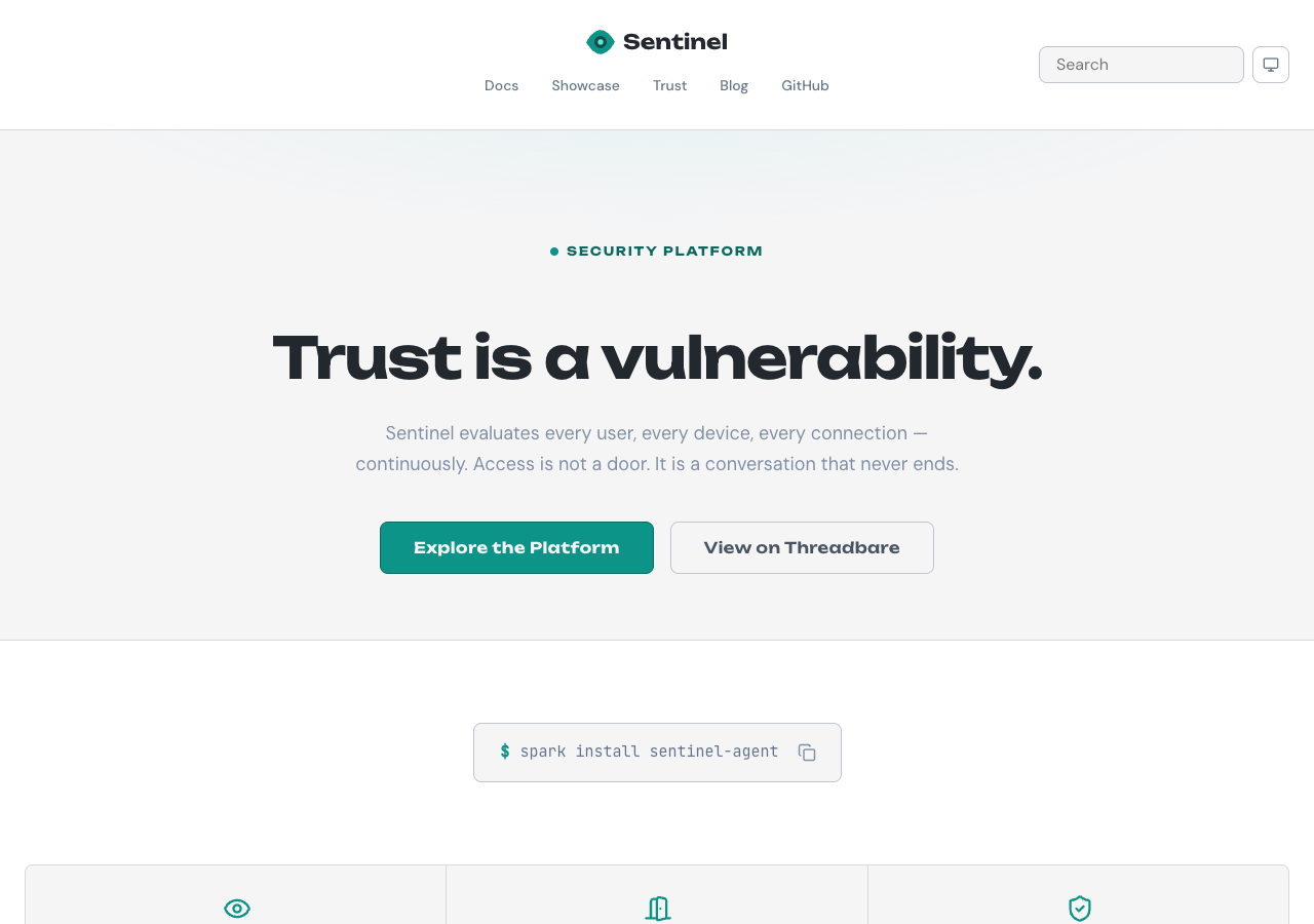
Preview
Summary
Sentinel is designed for security and compliance documentation. The cool palette communicates trust while the flat card depth keeps the layout clean and scannable. Motion is set to subtle speed with staggered reveals disabled and hover effects enabled.
Configuration
The full default configuration for the Sentinel preset:
{
  preset: 'sentinel',
  // Default values (no overrides needed):
  // colors.primary:          '#0d9488'
  // colors.accent:           '#6366f1'
  // colors.neutral:          '#64748b'
  // fonts.display:           'Unbounded'
  // fonts.body:              'DM Sans'
  // fonts.code:              'JetBrains Mono'
  // shape.radius:            'rounded'
  // shape.density:           'comfortable'
  // depth.cards:             'flat'
  // depth.codeBlocks:        'bordered'
  // motion.speed:            'subtle'
  // motion.staggeredReveals: false
  // motion.hoverEffects:     true
  // navbar:                  'canopy'
  // footer:                  'embassy'
}
Overrides
Override any category to customize the Sentinel identity. Unspecified values keep their defaults.
Navbar and Footer
Sentinel uses the Canopy navbar and Embassy footer.
| Slot | Variant | Description |
|---|---|---|
| Navbar | canopy | Navigation bar with canopy-style dropdown menus. |
| Footer | embassy | Structured footer with categorized link groups. |
Override the variant in the preset options:
{
  preset: 'sentinel',
  overrides: {
    navbar: 'bridge',
    footer: 'commons',
  },
}
Available navbar variants:
bridgecanopymonolithcompass
Available footer variants:
commonsembassyledgerlaunchpad